![]()
![]()

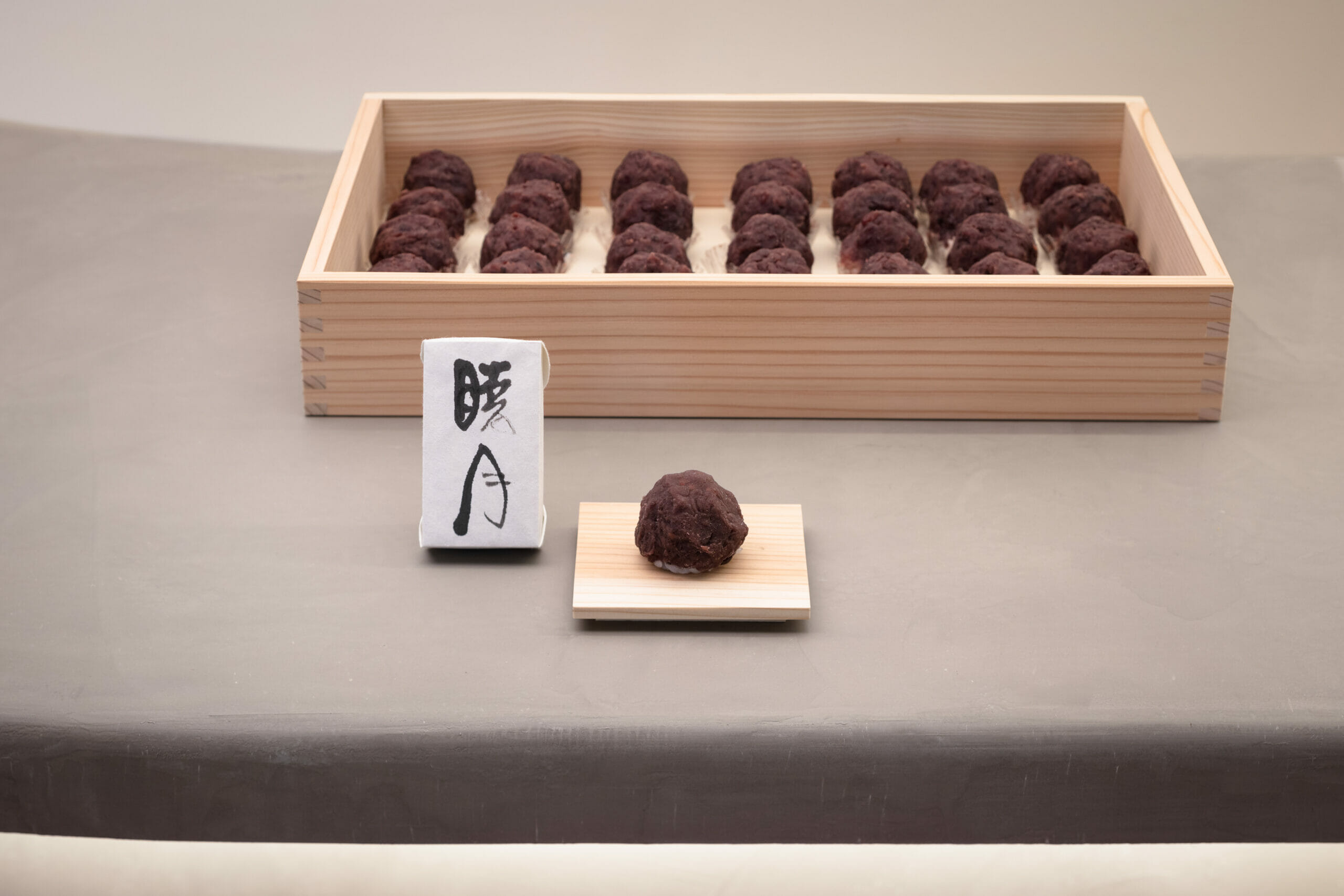
和菓子のohagi3初の旗艦店。
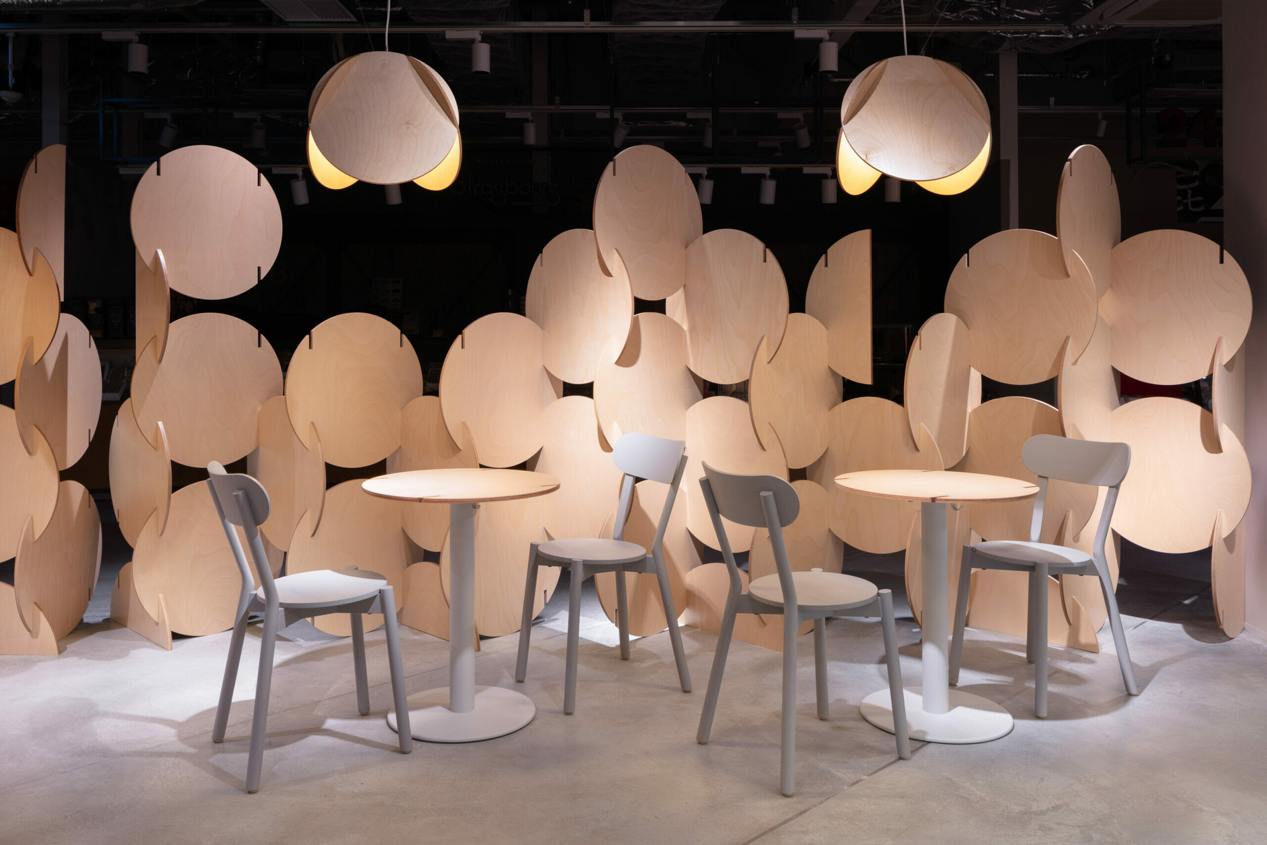
おはぎの円をモチーフとして展開し、空間・家具・照明をデザイン。
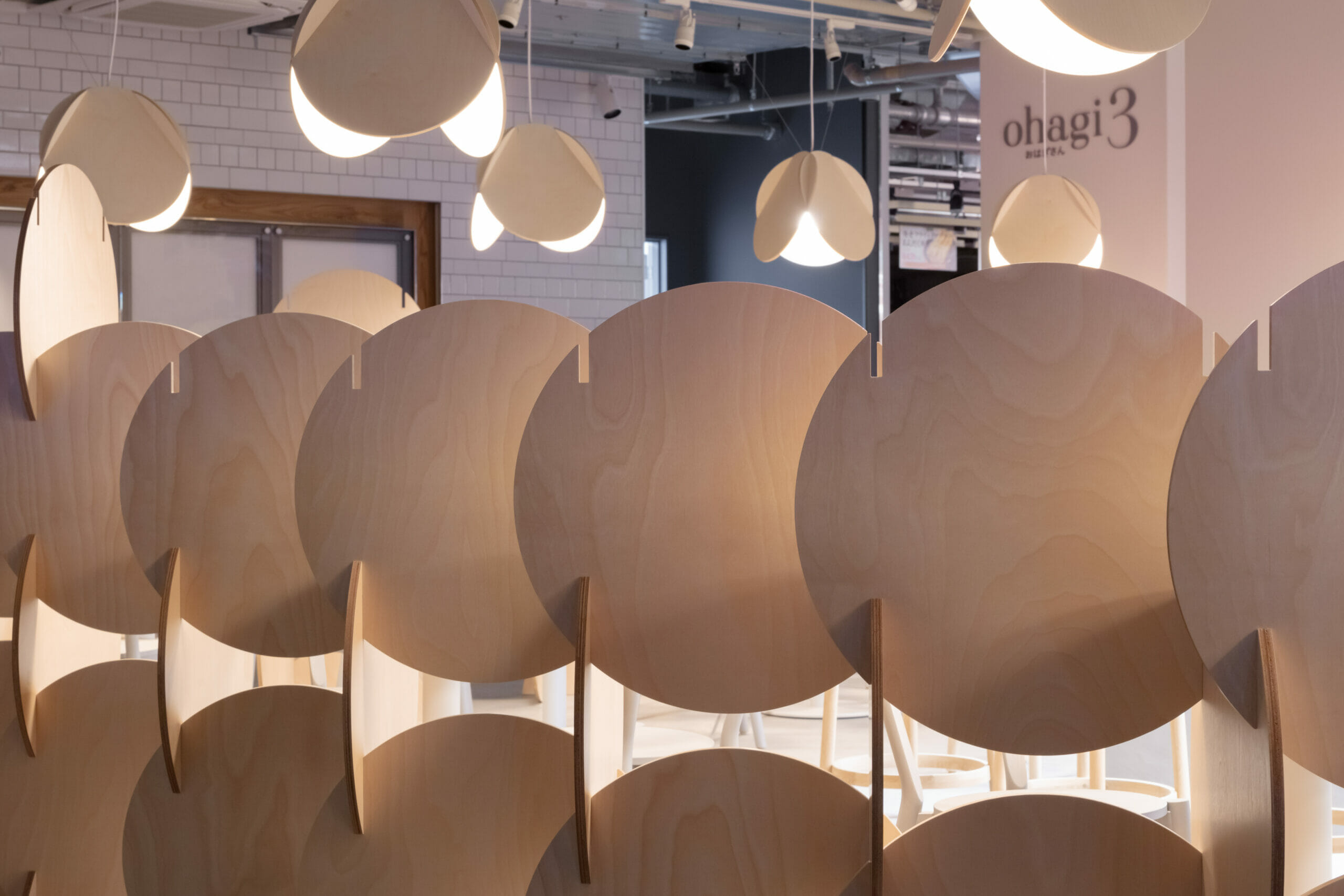
「ohagi wall」日本の伝統的な接手技術を応用し、円を積み木のように積み重ねたデザインとしました。
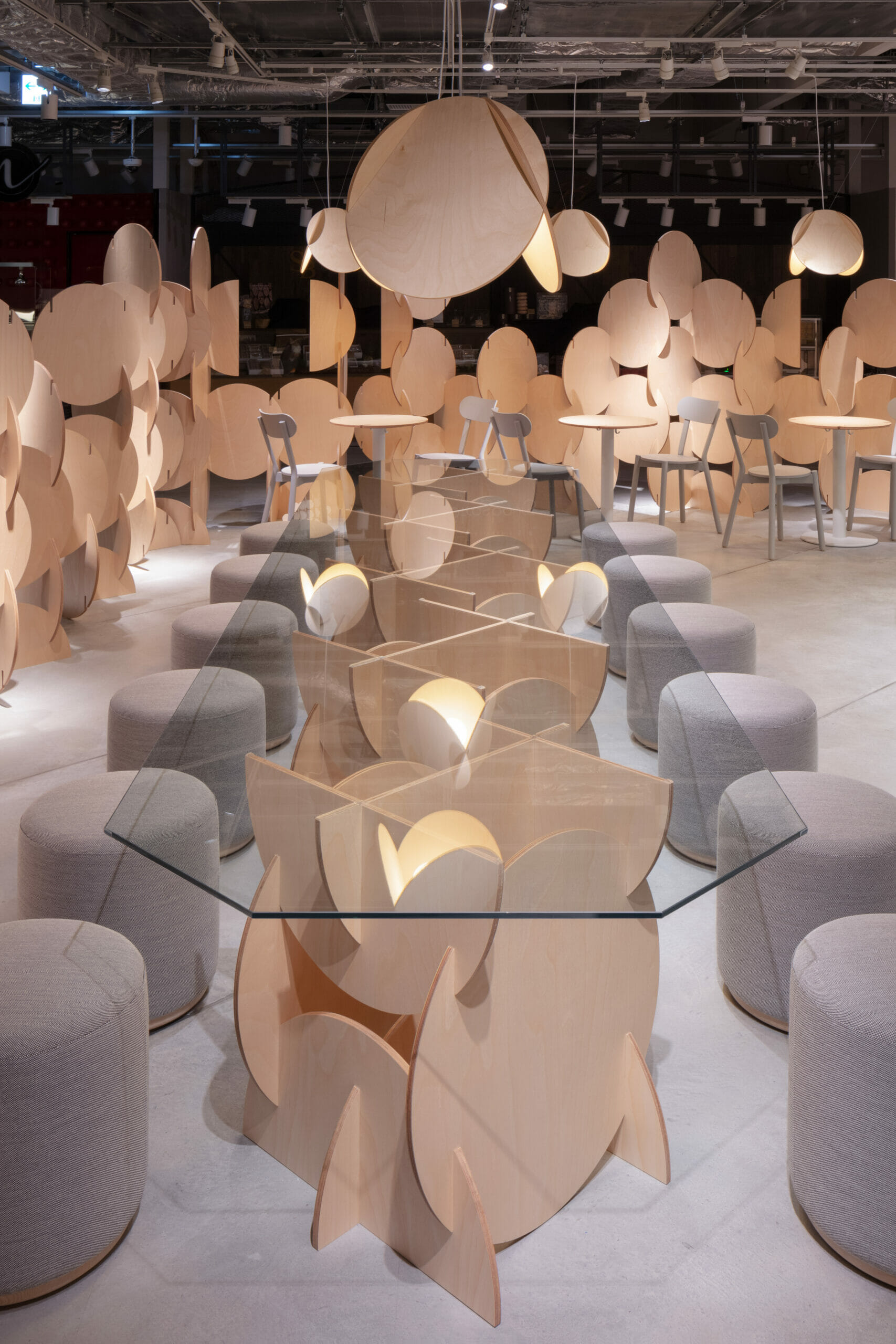
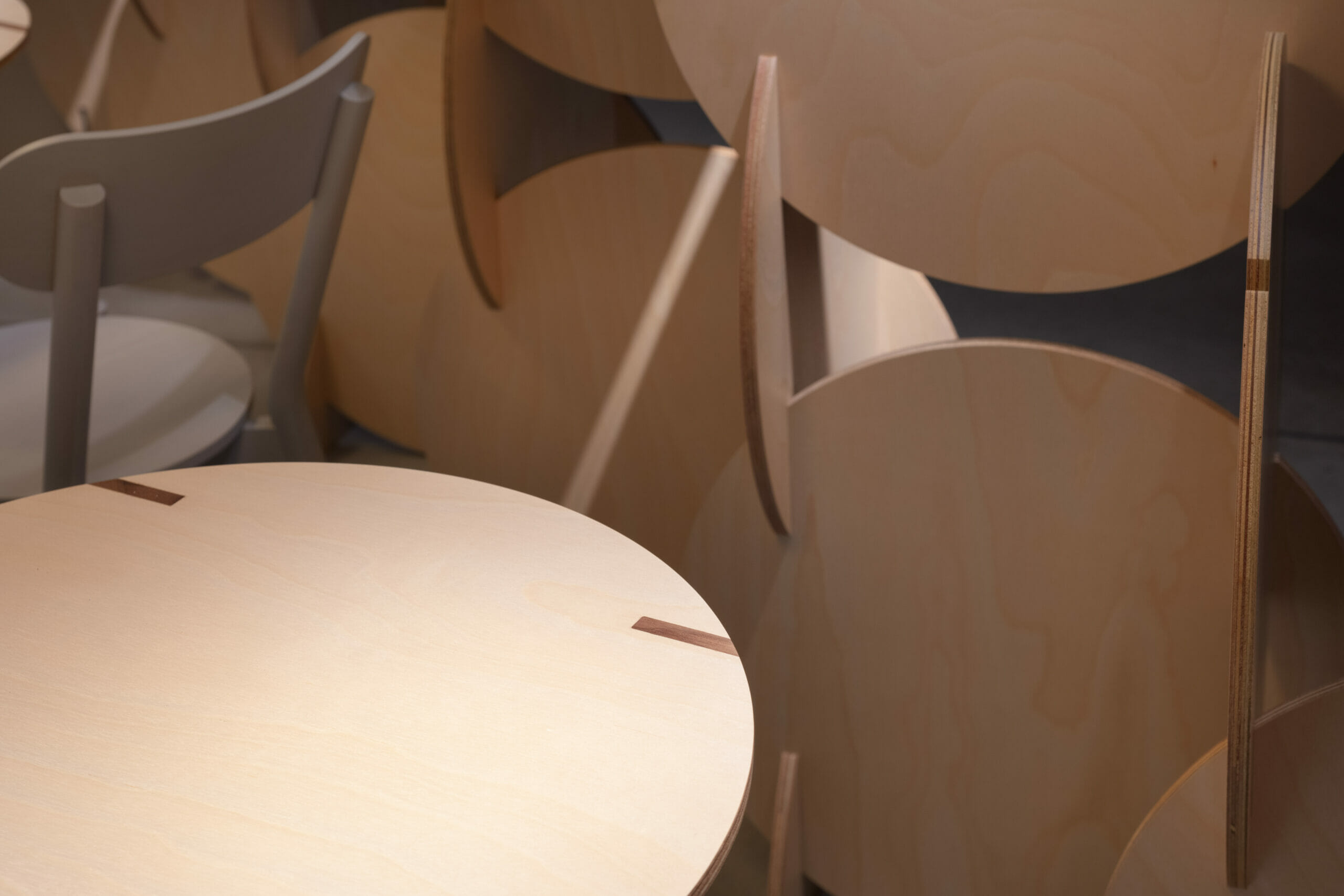
「ohagi table」は円ピースを天板とし、埋め木がアクセントになって
います。
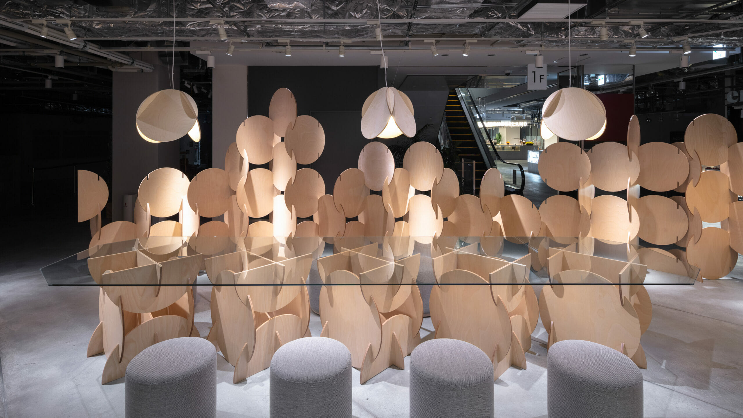
「ohagi BIG table」の大ガラスを支えるのもohagi wallです。
<ブランディング>
クリエイティブパートナーとして、新業態店舗のオープンに際するリブランディングディレクションを行いました。
ohagi3 のブランドをより体現するためブランドロゴを刷新。(ロゴデザイン/小野圭介氏)
円形をつなげたイメージでデザインしたシンボルマークには、カップ・ペーパーアイテムなど様々
なアイテムに展開可能な、洗練されたアイコン性を持たせました。店内サインやグラフィック、和菓子を提供する器に至るまで、店舗を
構成するデザイン全体のクリエイティブディレクションを行うことで、コンセプトを明確に表現しブランド価値を高めます。
It is a flagship store from the Japanese sweets “OHAGI3”.
<Spatial design>
We were asked for a high-impact design that takes advantage of the favorable location in front of the entrance on the first floor of the newly built complex.
Therefore, we developed the design with “circle” for various furniture, which is the identity of ohagi3.
“Ohagi light” is a pendant light with a circle folded in three by multiplying it with the brand keyword “3”. We are planning to introduce it to other stores, and it is an item that symbolizes the brand.
In the partition for the four passages, “ohagi wall” was made. Applying traditional Japanese joint technique, the design is made by stacking circles like building blocks.
Two types of tables are also designed using the circular piece of “ohagi wall”. The “ohagi table” uses a circular piece as the top plate and is accented with buried wood.
We also designed the “ohagi BIG table” for 12 people by combining the “ohagi wall” and glass.
<Branding>
As a creative partner, We provided rebranding direction for the opening of new stores.
The brand logo is redesigned to better embody the ohagi3 brand. (Logo design / Keisuke Ono)
There are various items such as cups and paper items in the symbol mark designed with the image of connecting circles.
It has a sophisticated iconic character that can be expanded into various items. From in-store signs, graphics, to vessels that provide Japanese sweets,
By performing creative direction for the entire design that composes, the concept is clearly expressed and the brand value is enhanced.
 ohagi
ohagi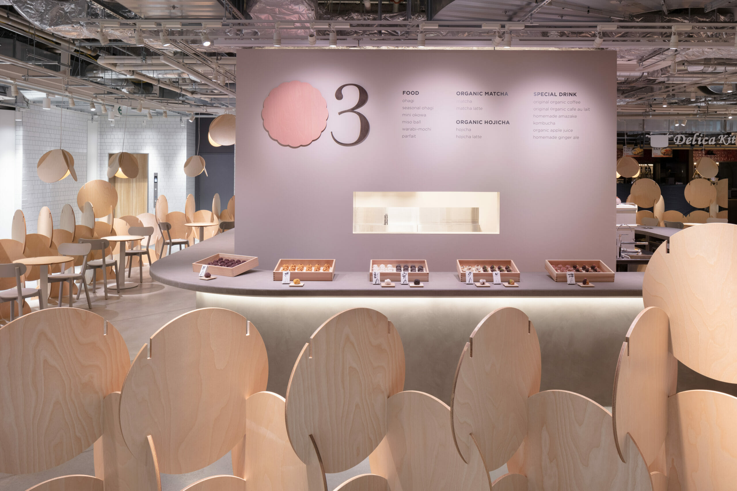 Main Counter
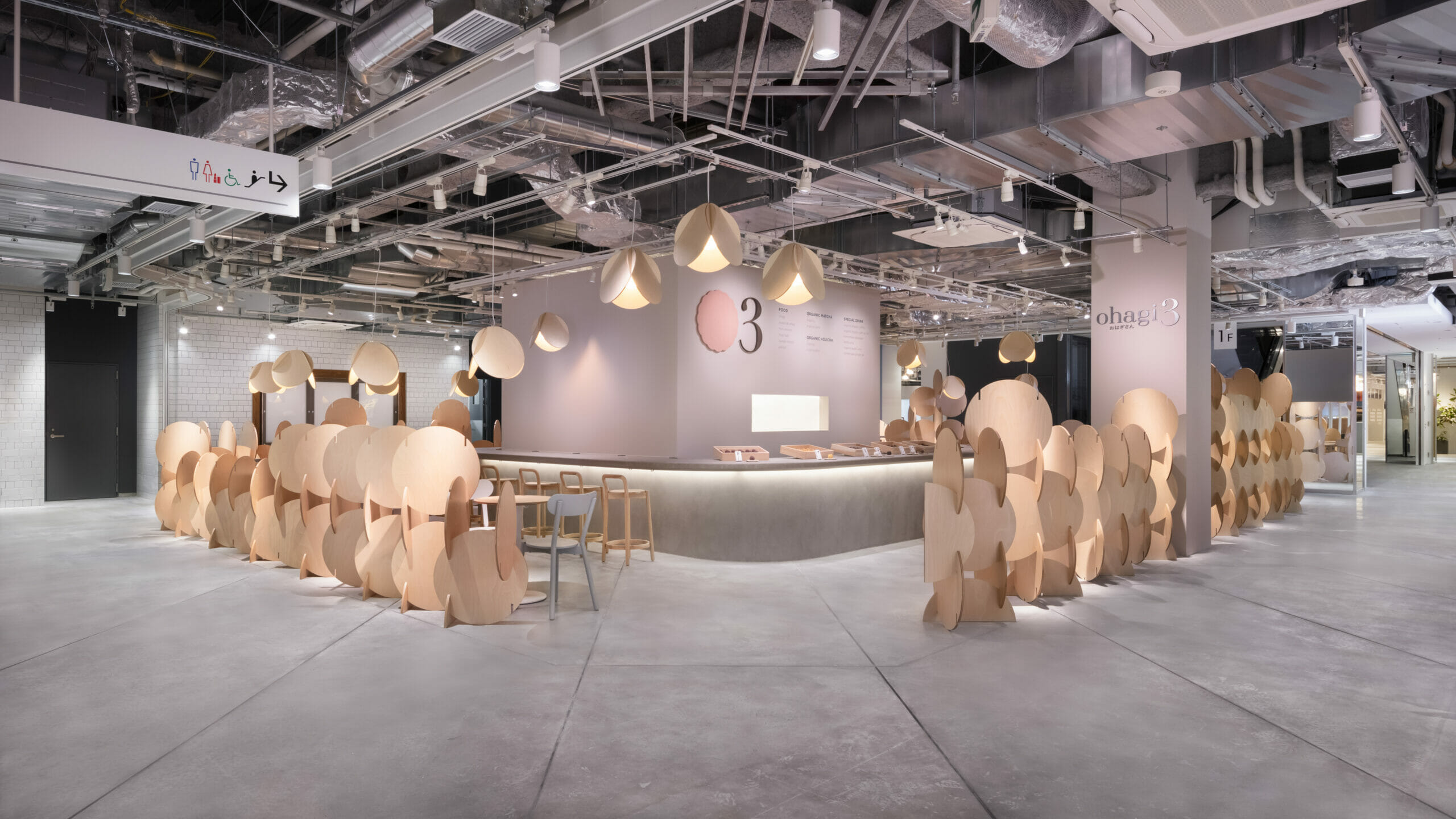 Photo: Takumi Ota
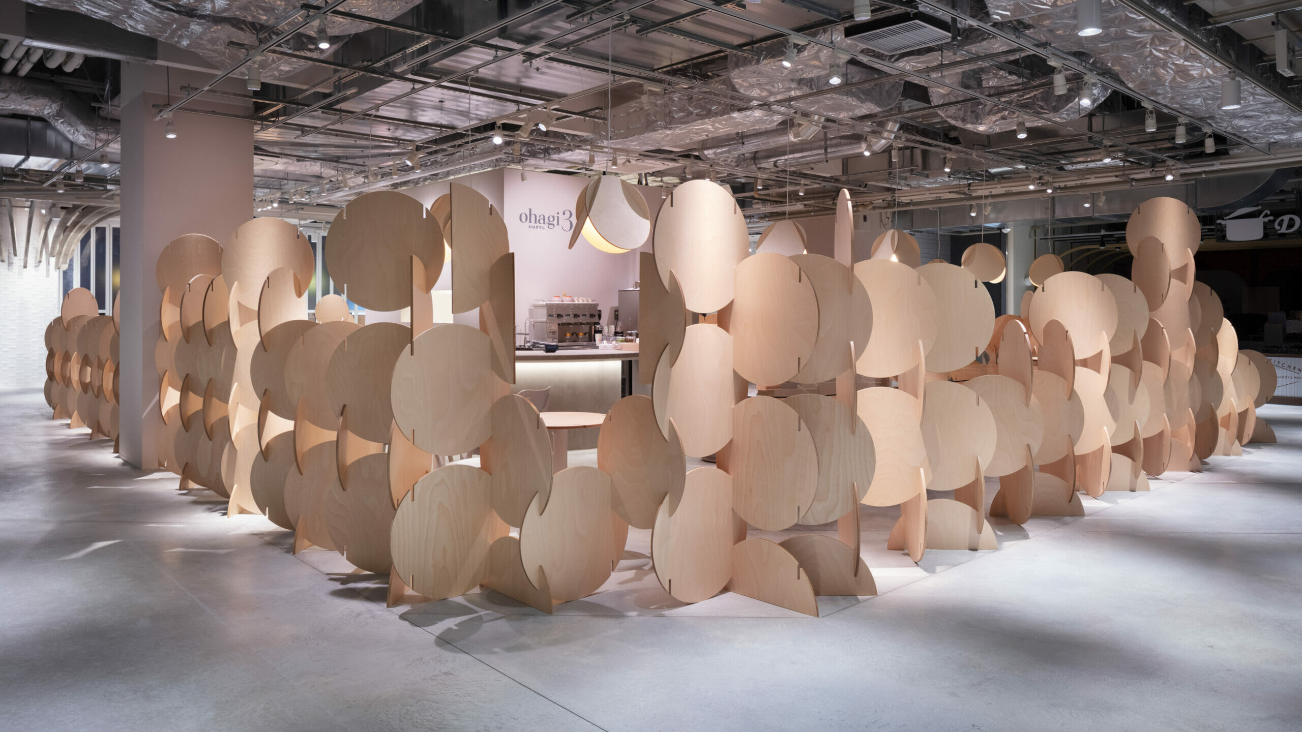 Side Corner
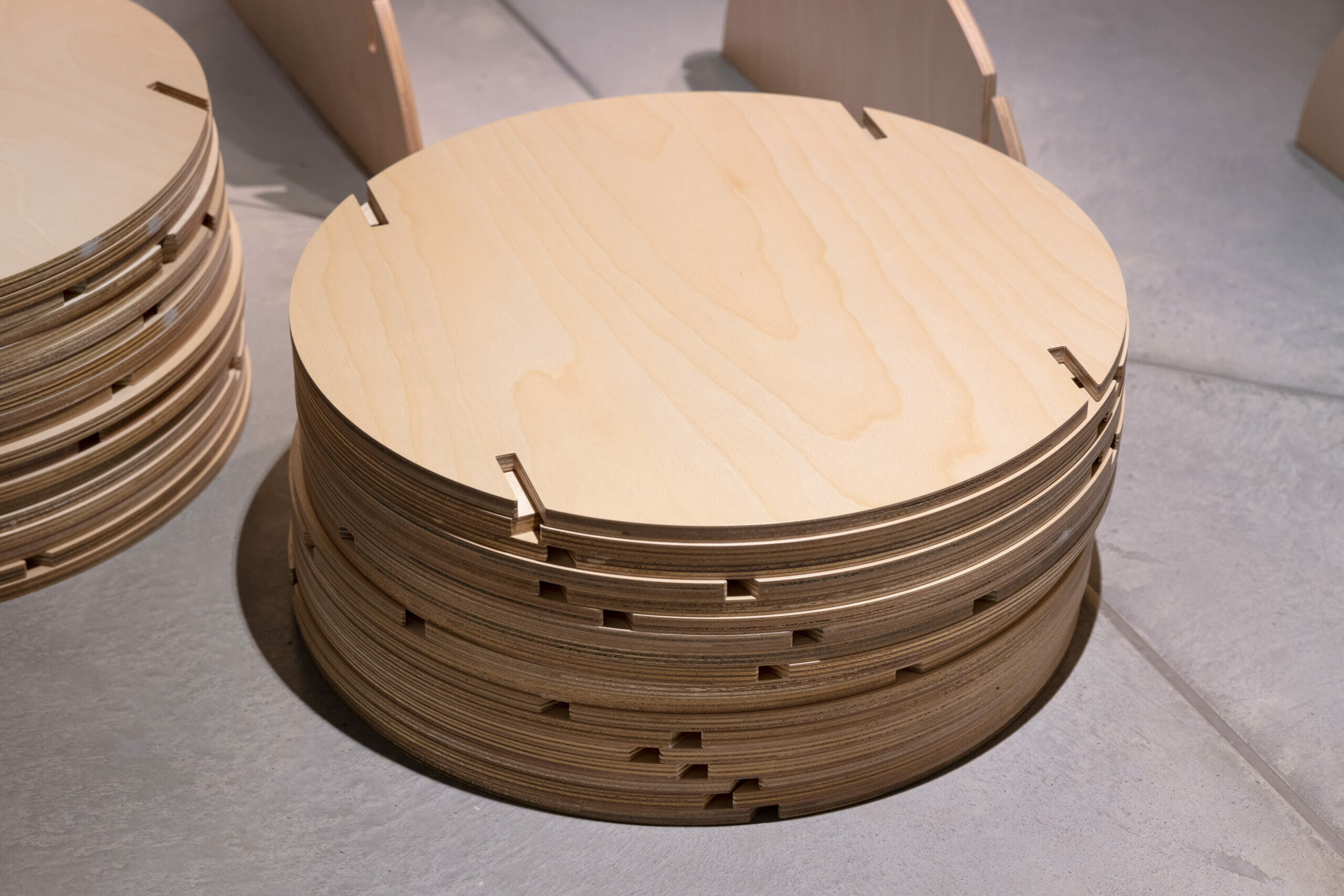 Wall Units
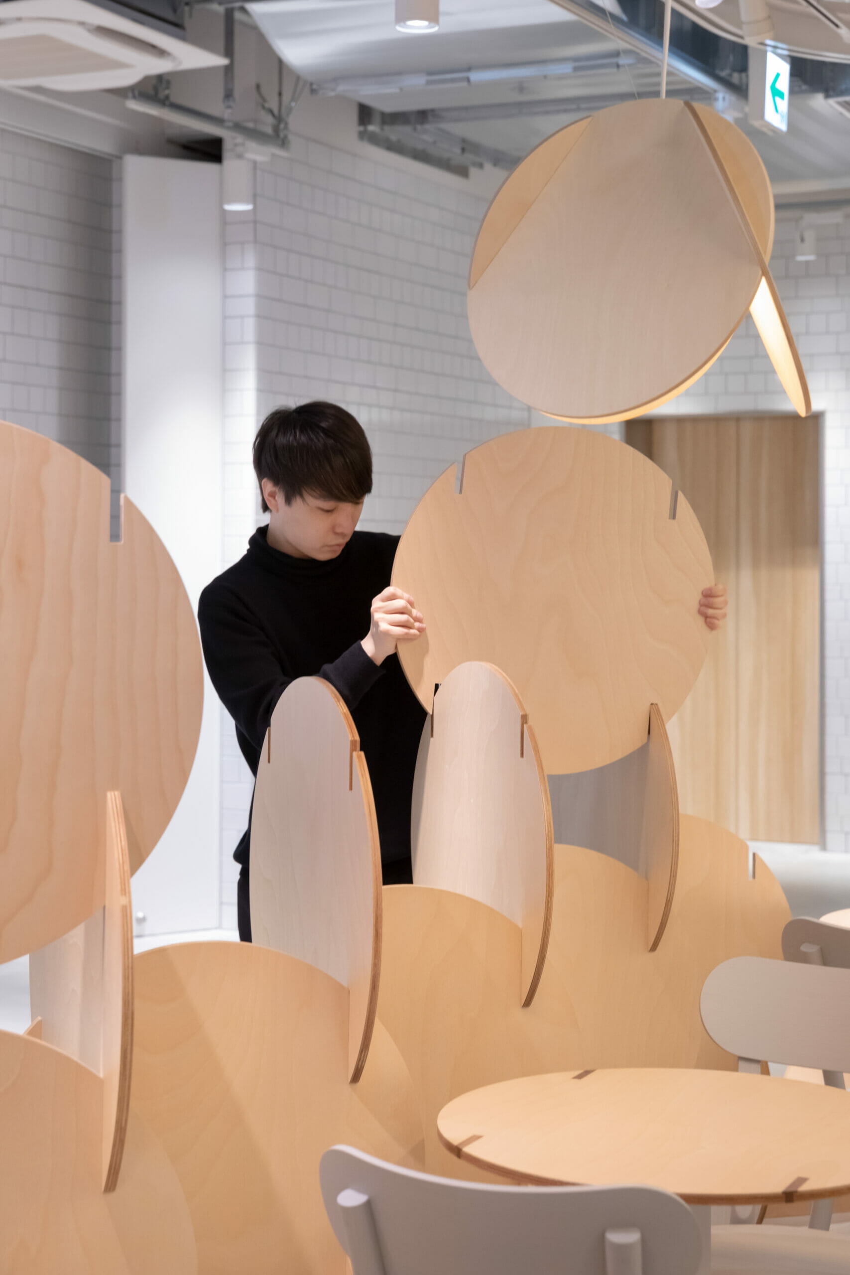 Ohagi Wall
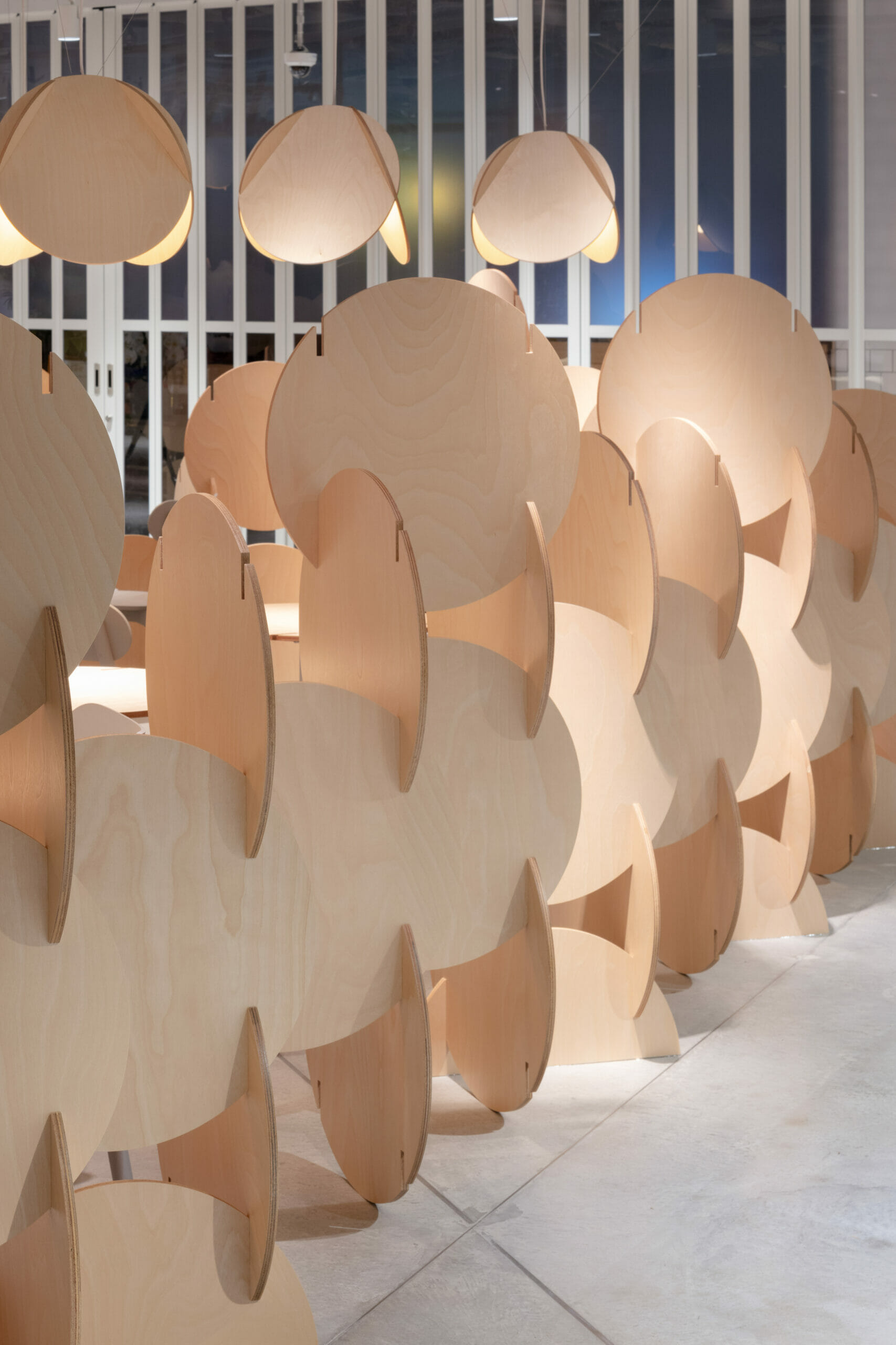 Ohagi Wall
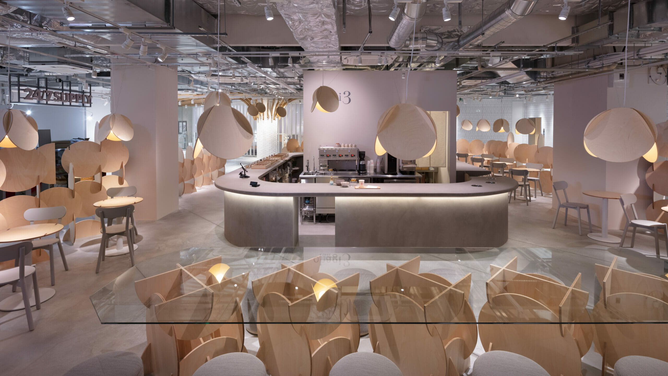 Cafe Counter
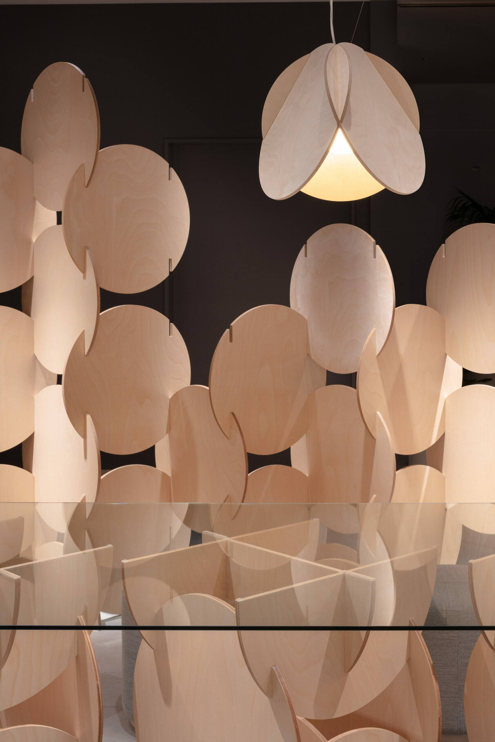
プロジェクト種別
ブランディング・インテリアデザイン
プロジェクト名
ohagi3 FLAGCAFE SAKAE
用途
物販飲食店
所在地
愛知県名古屋市中区栄3丁目3番地1号 Maruei Galleria(マルエイガレリア) 1F
規模
店舗床面積150㎡
進行状況
竣工
施主
ホリデイズ株式会社
施工者
ZYCC
協働
実施設計:ARCHDECO
照明:TILe
グラフィック:ONO BRAND DESIGN
ペンダントライトシェード制作:株式会社KOKKOK
プロジェクトチーム
Shuhei Kamiya, Tomoka Yasuoka, Shunsuke Sawai, Risako Arita(intern)
PROJECT CATEGORY
Branding. Interior Design
PROJECT NAME
ohagi3 FLAGSHIP SAKAE
LOCATION
3-3-1 Maruei Galleria 1F, Sakae, Naka-ku, Nagoya City, Aichi, Japan
SIZE
150㎡
STATUS
Under Construction (To Be Open on 30th March, 2022)
PRINCIPAL USE
Cafe, Merchandise
CLIENT
HOLIDAYS .Inc
CONSTRUCTOR
ZYCC
COLLABORATOR
Design Development: ARCHDECO
Lighting Design: TILe
Graphic Design: ONO Brand Design
Light Shade Manufacturer: KOKKOK
TEAM
Shuhei Kamiya, Tomoka Yasuoka, Shunsuke Sawai, Risako Arita(intern)